Imagine being in a new, wondrous place. Without guidance, you might miss out or not grasp every detail of it. But with a friendly local to lead, you’ll uncover every hidden corner.
Just like a friendly local who shows you around, app walkthroughs are like your helpful buddies, guiding you through how to use a new app.
TL;DR
- In-app walkthroughs simplify the onboarding process with interactive guidance, reducing confusion and improving retention.
- Key benefits include increased user understanding, reduced support tickets, and improved user loyalty.
- Best examples include apps like Binance, Slack, and ACT Fibernet, showcasing successful user engagement strategies.
What is in-app walkthrough and how does it work?
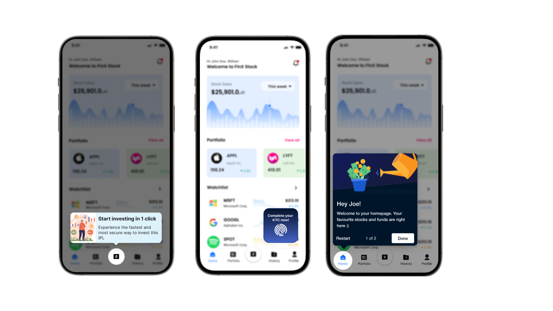
An in-app walkthrough serves as an interactive guide that leads new users through an app, step-by-step. It highlights the main features and provides a clear path to understanding the app’s functionalities. These walkthroughs often include tooltips, spotlights, carousels, and other in-app messages that draw attention to key features. This not only helps users learn how to use the app but also ensures that they interact with important elements that lead to higher activation and retention rates.
For example, when you open a new app, you might see a popup or a small animation showing you how to navigate or use its features. This is the essence of an in-app walkthrough: a guided experience designed to speed up the learning curve.
Why Do You Need a Good In-App Walkthrough?
Here are the three key reasons why you need a good app walkthrough:
- Simplified understanding: Your product is more intricate than you realize. Even the simplest apps benefit from walkthroughs to ensure users understand their value.
- Reduced support: A solid app walkthrough reduces support tickets by guiding users through key app aspects, preemptively solving issues.
- Boosted loyalty: Effective onboarding via a good app walkthrough enhances user retention, preventing churn due to confusion.
Best examples of in-app walkthroughs
Binance
Binance uses an in-app walkthrough to guide users through their first trade. This helps activate users and improves retention by showcasing the app’s core features.
.gif)
Product Hunt
Onboarding tooltips are used for an app walkthrough in the Product Hunt app to help activate its users by providing guidance and education about the app’s features and functionality.
By providing tooltips at the right moments, it simplifies complex functionality and guides users through the learning process.

Slack
Slack immediately presents its features upon app launch through four walkthrough screens. This exemplifies value-driven onboarding, establishing app context, and showcasing advantages.
.gif)
Gmail
The Gmail app uses a series of tooltips for an app walkthrough. This effectively emphasizes and showcases its core features, enabling users to easily discover and utilize the full range of functionalities offered by the platform.
%2520(online-video-cutter.com)%2520(1).gif)
ACT Fibernet
Incorporating an app walkthrough using spotlights, ACT Fibernet emphasizes vital features and ensures a smooth onboarding process. It ensures that new users possess the essential knowledge to navigate the platform proficiently.
This educational approach significantly improves the activation rates of new users, providing them with a positive initial experience and reducing barriers to entry.
.gif)
Challenges in Building In-App Walkthroughs and Stories In-House
While in-house teams are often equipped to develop core product features, creating effective app walkthroughs and stories requires additional resources. Here are a few challenges:
- Limited engineering bandwidth: Developers often have to prioritize critical product work, leaving little room to implement and maintain walkthroughs and stories.
- Time-intensive updates: Each new experiment or iteration of a walkthrough can take weeks to build and test, delaying improvements and making it difficult to optimize quickly.
How Plotline Helps You Build In-App Walkthroughs - No Code Required
Plotline enables B2C growth and marketing teams to create customizable in-app walkthroughs and stories without writing a single line of code. You can easily deploy interactive guides that match your app’s design theme and target specific user segments, speeding up the onboarding process and boosting user activation rates.
With Plotline, you can focus on delivering value to your users without the hassle of managing code or relying on engineering teams. This makes the process of building engaging app experiences faster, simpler, and more efficient.
If you’d like to know how Plotline’s in-app messages activate more users with better onboarding walkthroughs, book a demo with us.
CoinDCX Success Story: Boosting First Trade Engagement

A perfect example of how effective in-app walkthroughs can dramatically increase user engagement comes from CoinDCX, a leading cryptocurrency trading platform. Their campaign aimed to increase the number of new users who start their first trade after onboarding.
The Challenge
CoinDCX realized that many new users were not familiar with key features of the app after completing the onboarding process. This lack of familiarity meant they weren’t taking the critical first step—making their first trade.
The Solution
CoinDCX used Plotline’s no-code platform to design a simple, multi-step guided walkthrough. The walkthrough was strategically placed on the homepage and focused on educating users about the app’s core features. By highlighting the essential actions and functions, CoinDCX ensured that new users would have the confidence to make their first trade.
The Results
The results were impressive: ~45% of users who engaged with the 6-step walkthrough went on to start their first trade. This success highlights the power of a well-designed, interactive onboarding experience in improving user activation and ensuring a seamless journey for new users.
Summary
In-app walkthroughs and stories are crucial tools for ensuring users understand an app’s core features and functionality, improving both engagement and retention. Walkthroughs guide users through key features while stories offer a fun, dynamic way to promote offers, features, or brand messages.
Despite their importance, building these in-house can be challenging due to limited engineering resources and time constraints. Plotline offers a no-code solution that empowers product and marketing teams to create effective in-app experiences with ease, allowing you to focus on what matters most—your users.

